
Have you ever wondered as a customer what affects your purchasing decision in online channels? Of course, the first one that comes to mind is price and product but we all know that there is another factor that almost has a similar weight in the decision process of the customer, that is the design of the e-commerce website.
Because even if you sell the most preferred product at the most affordable price, if the consumer cannot navigate your site easily and has encountered any difficulty during their journey, it means your brand has lost them.
In today’s digitalized world, the e-commerce industry is growing exponentially. According to Statista, in 2020, retail e-commerce sales worldwide amounted to 4.28 trillion US dollars and e-retail revenues are projected to grow to 5.4 trillion US dollars in 2022.
Within this booming business, e-commerce websites are becoming more and more common, and with the increasing competition in the industry, e-commerce website design has skyrocketed in popularity over the past decade.
Being able to differentiate from the competition depends on providing a seamless experience. So, what makes a good e-commerce website? What should you pay attention to while designing to offer this seamlessness? To answer these questions, let's first look at some key elements of web design and discover e-commerce website design tips together.
What is User Experience (UX)?
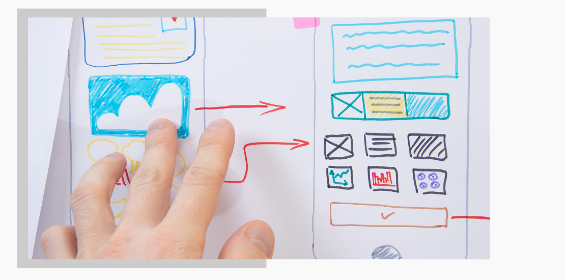
The user experience (UX) is the totality of a person’s interactions with your company from initial awareness, interaction, and transaction right through to the end of their lifecycle. Whether you’re designing for websites, mobile apps, or anything in between; the end goal is to deliver an exceptional user experience that aligns with business goals.
Almost 90% of online consumers say that they wouldn’t prefer to visit a website again after having an unsatisfactory user experience. This rate shows how careful you should be about the user experience.
Different business goals require different types of user experiences thus require different UX website design principles, but ultimately they need to be cohesive across all channels in order to offer a consistent brand experience.

What is User Interface (UI)?
User interface (UI) refers to the broad characteristics of a web page, an application, or a system that are perceived by users. Texts, buttons, colors, images everything a user interacts with are included in UI. Good UI design increases the likelihood that users will successfully attain their goals, and also creates a strong positive impression of the brand.
UI is one of the most important aspects of designing a website. It’s what attracts customers and affects their decisions to buy or move on. Poorly designed UI will leave your visitors dissatisfied, while good UI will keep them coming back for more.
UI vs UX, What's The Difference?
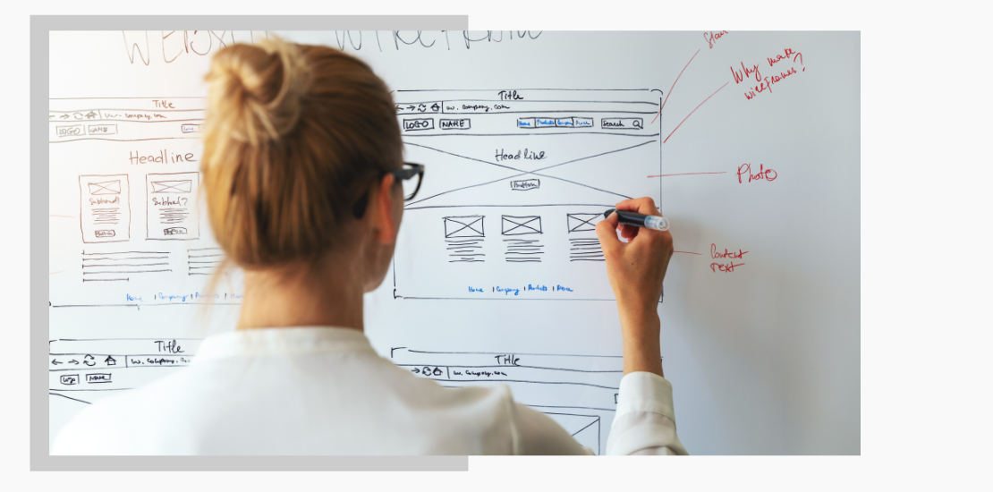
What’s the difference between UI and UX? The terms UI and UX are often used interchangeably, but they refer to two very different facets of your website.
The UI focuses on all the visual elements on the website, determines the design elements from the font selection to color palette, frame type of images to the types of icons, and designs them in integrity. UX, on the other hand, establishes the main structure that determines the interaction of the consumer with these elements and focuses on the consumer and their journey.
What you see is not always what you get. UX and UI designs together form a perfected whole, prevent that disappointment and provide the experience your customers want.
Importance of Home Page Design for E-Commerce
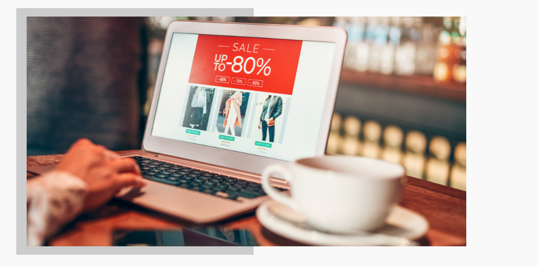
The home page is your first exam, where you establish the first contact with the online shopper and will make them decide whether they continue their journey. A retail homepage may include a menu, search bar, category list, recent campaign information, and many more different elements.
Here, you should make sure that all the necessary elements are included and easily accessible for the consumer to continue their journey. Make sure that you use the power of catchy areas such as banners and offer bars correctly. You can lower the bounce rate with an engaging, trustworthy, and encouraging design.
An e-commerce website can get effective results by welcoming users with a user-friendly homepage. Take one of our customer’s cases as an example; the Inveon UI&UX team followed consumer behaviors and industry trends for a child clothing brand and found some areas to be improved. In just one month, with the interventions they made by changing the position of the product widgets on the homepage and increasing the number of products displayed in specified areas, the conversion rate increased by 20% from the "products you may like" section, and 4 times more revenue was obtained from this area.
How to Design Product Search Pages?
In a web store with thousands of products, the easiest way to find the product you are looking for is to run a search function. It is quite obvious that a consumer who cannot reach satisfactory results as a result of the search will abandon the page.
Availability of the search function is one of the simplest but most important points. Hubspot research reveals that 76% of consumers consider the most crucial factor in a website's design as "the website makes it easy for me to find what I want."
Considering the possibility of the user making a search by product name, category name, or any related information, you should configure your search functions accordingly to make sure they can reach the desired outcome through various attempts. In this way, you will not lose your customer in cases where there are typos or products can be searched in different ways.
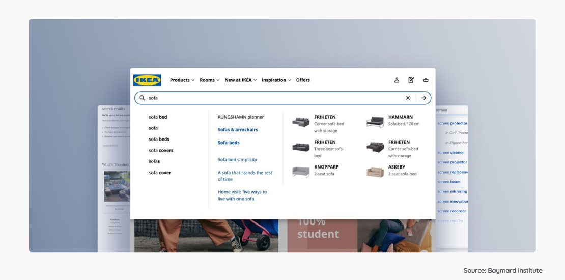
Also providing a proactive search experience with auto-complete options and smart suggestions increases customer satisfaction. At the same time, by saving time, you also improve the consumer's experience and bring them one step closer to purchasing. Being able to offer alternatives instead of showing a simple “product not found” alert is an important way to persuade the consumer to stay on your website.
In addition to fulfilling these basic functions we have mentioned, there are of course many other improvements you can make, from generating personalized search results to offering smart suggestions or running advanced recommendation engine mechanisms, you can increase your conversion rate with diverse solutions specific to your brand.
How to Design Product Pages?
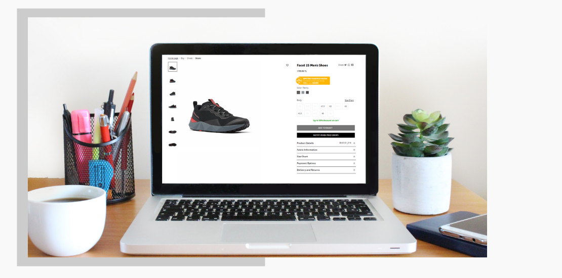
Through the journey of a consumer, now is the time for them to visit a product page. On the e-commerce product page, it is essential to provide basic information such as product price and product images, while at the same time all relevant product details should be accessible. The most important rule with product page design is to be mindful of the risk of overwhelming the customer with too much information.
A fine balance needs to be struck of creating an easy-to-browse and well-coordinated product page while showing only the right amount of information.
Depending on the product type, the use of good-quality images or videos is an important factor affecting the consumer's behavior towards purchasing. You can reduce distraction by presenting images that can scale correctly according to the device and images that are large enough to understand the details. A successful product page should be designed to answer every question through images, detailed explanations, and useful additional information.
Additively, displaying complementary or related products on product pages and offering personalized recommendations create an important opportunity for cross-selling.
What you will present in the act of adding a product to the cart is also as important as the information you provide on the product page. Different setups, such as showing variations of the same product, providing unit price information, giving the option to add to favorites, and using social proof for persuasion will determine whether the purchasing behavior will be completed or not.

How to Design Checkout Pages?
You’re almost there, but the keyword here is ‘almost’. You managed a customer to add the product to their cart, but will you be able to make them complete their purchase? Baymard Institute research suggests that through an optimized checkout page design, you can increase the conversion rate by 35%.
In this step, where the user makes the final decision, a website should present an easy, understandable, fast, and responsive design and be able to ensure the completion of the process without the consumer changing their mind.
At the payment step, users want to be sure that exactly for what, how much, and in what way they will pay. Therefore, it will be to your benefit to show an order summary and visualize the functions on the checkout page. Moreover, allowing the user to easily make last-minute changes, such as changing the amount, removing a product from the basket, or adding one more can help them to continue the process.
It would be beneficial to offer different payment options in order to meet as many consumer needs as possible. You can reduce the pressure on the consumer by keeping registration-optional to complete the checkout step. However, encouraging registration and making it attractive is also something that needs to be addressed.
If checkout processes consist of more than one step, providing an indication of which step has been taken will eliminate confusion and disturbance. In addition, it is also very important to offer help without distracting the customer or without causing the consumer to leave the page like making the live support options easily accessible so that the answers to the questions that may come to mind during the checkout can be easily found without a hitch in the purchasing process.

Summary of E-commerce Design Tips
A seamless experience is essential for a consumer who shops online. Great e-commerce website design requires multidimensional thinking and building an advanced structure. Besides, it takes a lot of effort to create brand-specific designs that appeal to your target consumer group and requires significant expertise.
The items we mentioned above are just the tip of the iceberg. The effects of new icons to be added to the cart step, a few items to be reorganized on your homepage, and editing descriptions on product pages only can be revealed with a detailed examination specific to your brand. Then actionable insights can be provided through the comprehensive work of an expert team.
Our UI & UX Design Team was established for this very reason. To analyze what your website needs to increase the conversion rate among users who come to your site, create loyal customers, and ensure that every consumer who uses your website gets the best experience, simply get in touch with Inveon experts today. Our dedicated experts are here for detecting pain points of your customers’ journey, and optimizing the interface and experience tailored to your target audience.
